Color & Design Specific Perfume Boxes
A color that looks right on your monitor is a set of light values. A color on a box is ink sitting on a coated or uncoated surface, and the two do not automatically agree. This category covers the eleven colorways we print most, and what each one demands from the press.
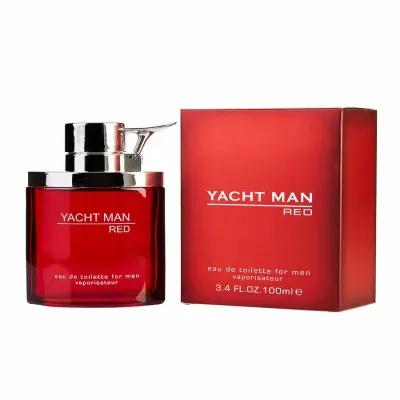
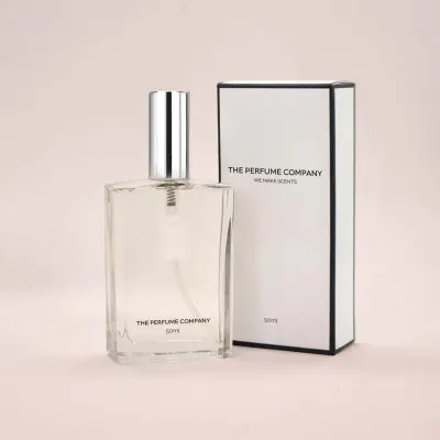
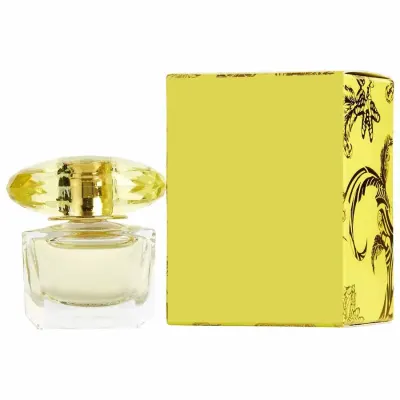
Get a price for Color & Design Specific Boxes
Tell us size, quantity and finish. A written quote comes back within 10 hours, with free design support and no obligation.
- 100 boxes minimum per design
- Free digital proof before anything prints
- Free shipping to the US, UK, Canada, Australia and New Zealand
Why your screen color and your box color disagree
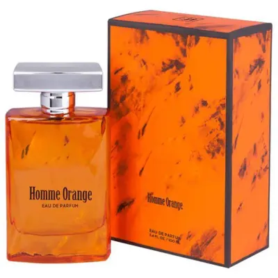
Screens emit light and mix red, green and blue. Presses lay ink and mix cyan, magenta, yellow and black. There are colors a screen can show that four-color process simply cannot reach, and the most common casualties in fragrance packaging are vivid oranges, deep purples and any saturated turquoise.
When a color has to match exactly — a brand color that also appears on your bottle label — the answer is a Pantone spot ink rather than a process build. A spot ink is mixed to a formula and printed from its own unit, so it lands the same on every run. It costs more per plate and pays for itself the first time a reorder matches the original.
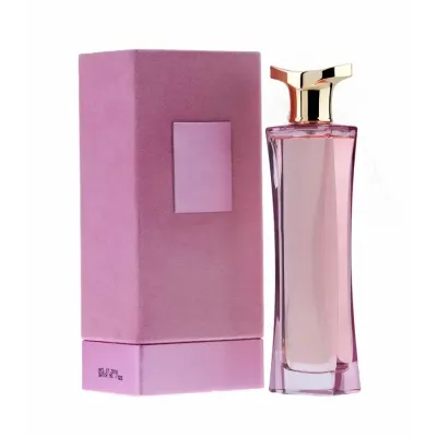
Pastels deserve a word of their own here: a light tint drifts visibly when press density moves even slightly, which is why our soft pink fragrance cartons are proofed on the actual stock before a run is signed off.
The colors that fight the press
Deep blacks print flat and gray if you send 100% K alone. A rich black build adds cyan under the black to give it depth, which is why our matte black perfume cartons are set up with a four-color black rather than a single plate.
Large solid areas of any color show every imperfection: roller marks, slight density drift across the sheet, and any speck of dust on the plate. On a full-bleed colored box this is the quality difference you are paying for, and it is why we proof solids on the actual stock rather than on a generic proofing paper.
Pastels have the opposite problem. A pale pink is a light tint, and light tints drift visibly when press density moves even slightly. We run pale tints with tighter density tolerances for exactly this reason.
How finish changes the color you get
The same ink under three finishes gives three different colors. Gloss lamination deepens and saturates, so a mid blue goes richer. Matte lamination scatters light and lifts the color slightly while flattening contrast. Soft-touch does what matte does and mutes it further.
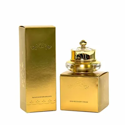
This matters most when a design pairs a laminated panel with an unlaminated one, or when a box has to sit beside a bottle label printed by a different supplier. If your bottle label is glossy and your box is soft-touch, the identical brand color will look like two colors on the shelf. Deciding the finish before the color is signed off avoids the whole problem, and metallic effects like our gold foil perfume packaging change the calculation again, because foil is reflective rather than absorptive.
Designing for a colorway rather than a color
Brands that run several fragrances usually want a family: one structure, one layout, different colors per scent. Done well this reads as a collection at shelf. Done carelessly it reads as inconsistency, because each color needs a slightly different treatment to carry the same weight.
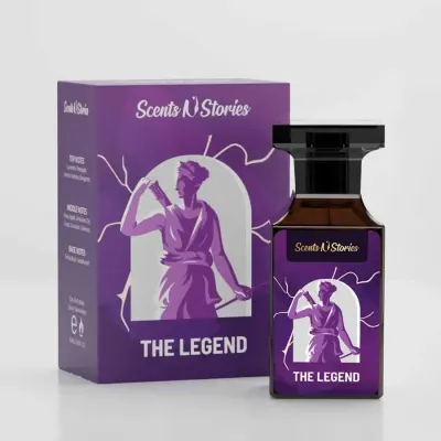
The practical rule is to hold the ink coverage roughly constant across the family. A design that is 90% coverage in deep purple fragrance cartons and 20% coverage in the yellow of the same family will not look like siblings, however identical the layout is. Adjust the artwork per color rather than recoloring one file.
Getting the color signed off before you commit
A digital proof shows layout, text and position. It does not show final color, because your monitor and our press are different devices. For color-critical work, ask for a printed sample on your actual stock and finish before the run.
We produce these on request and they add a few days to the schedule. Given that a colorway error is unrecoverable once 5,000 boxes are printed, it is the cheapest insurance available on the job. Send your specification through the quote request form and note that you want a printed sample.
Color & Design Specific Boxes: questions buyers ask
What is the difference between CMYK and PMS for my boxes?
CMYK builds a color from four process inks and suits photographic and multi-color artwork. PMS is a pre-mixed spot ink printed from its own unit, so it repeats exactly across reorders. Use PMS when the color is a brand asset that must match your bottle label.
Why does my box color look different from my screen?
Screens emit light in RGB; presses lay ink in CMYK. Saturated oranges, purples and turquoises are the most common colors that exist on screen but fall outside the printable range. A Pantone spot ink solves it when the color is critical.
Does lamination change the printed color?
Yes. Gloss deepens and saturates, matte lifts and flattens, and soft-touch mutes further. Decide the finish before you sign off the color, especially if the box has to sit beside a differently finished bottle label.
Can I order one structure in several colors?
Yes, and it is a common brief for fragrance families. The minimum of 100 units applies per design, and each colorway counts as a design because it needs its own plates.
Can I get a printed sample before the full run?
Yes, on request. It is printed on your actual stock with your actual finish, which a digital proof cannot show. It adds a few days but removes the one error that cannot be corrected after production.
Why does a solid black box sometimes print flat and gray?
Because it was sent as 100 percent black alone. A single black plate has no depth on a large panel. We set up black cartons with a rich black build that adds cyan under the black, which gives a dense, even solid rather than a charcoal that looks slightly washed out under shop lighting.
Will my brand color print the same on kraft board as on white SBS?
No. Kraft has a brown base and every ink laid over it shifts toward that base, so a mid blue goes dull and a yellow goes olive. White SBS gives the color as mixed. If you need the same shade on both boards, we print a white underlayer on the kraft at extra cost and proof both.
Why do pastel boxes need tighter press tolerances?
A pale pink or mint is a light tint, often under 20 percent ink. Light tints show any drift in press density as a visible change in shade, where a saturated color hides the same drift. We run pastel colorways with tighter density tolerances and proof them on the actual stock for that reason.
Do large solid-color panels show more flaws than a busy design?
Yes. A full-bleed solid shows roller marks, density drift across the sheet and any speck of dust on the plate, where a detailed layout hides all three. This is the quality difference between presses, and it is why we proof solid colorways on the real board instead of a generic proofing paper.
How do I match my box to a bottle label printed by another supplier?
Match the finish first, then the color. If the label is gloss and the box is soft-touch, the same ink reads as two different colors on the shelf. Send us a physical label, tell us which Pantone or build it uses, and ask for a printed sample so you can hold the two together.